Published and created by GrowSkills Pearson – engleze.com
This section is all about speech. If you have a heavy accent then concentrating on making your speech more understandable will help you greatly. Don’t feel like you must talk quickly, in fact the amount of time allocated to you to answer is more than enough to get your point across. Speaking slower and defining your words will get you a higher score than rushing and not speaking in a confident manner.
What you will be learning in this section is how to pronounce and articulate information in a clear and professional way. How clearly you speak is something that is highly important in your real PTE Academic exam as it will showcase your ability to communicate. Oral fluency, or how easily you can express your thoughts and ideas, is another key skill looked for in the Describe Image questions.
Tips on Describing Image You See on Your Screen
In the Describe Image question type in PTE Academic, you will see an image on your computer screen. Your task is to describe the main information contained in this image as accurately as possible. You will have about 20 seconds to prepare the response and then another 30~40 seconds to record your response. Your score will depend upon how accurately you capture the main points in your response.
You must have finished saying everything that you wanted to by the end of the 40 seconds.
The aim is to understand the difference between methods of data collection or to explain a particular process. Your goal is to paint an accurate verbal picture of what the data is showing.
Top tip, in each image, establish:
- What type of data collection you are looking at.
- What is being compared?
- What do the results say?
- Conclusion.
Most Describe Image questions will require you to compare data or describe a process so use the above points to help you every time you practice to get yourself used to how to structure an answer such as this.
These questions look a lot like real exam questions, no matter what you choose to study. Verbal communication skills are not only important for work and education but in your day to day life, so all-around great skills for you to get practicing.
Try these Describe Image Questions from recent GrowSkills Pearson PTE exams and see where you stand. Don’t forget to grab the full FREE Questions Bank with many new questions!
The Complete Describe Image PTE Questions
Question 1
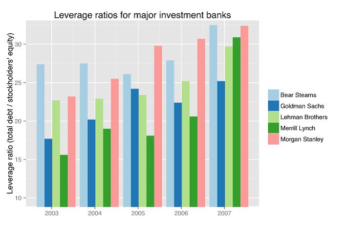
Leverage ratios for major investment banks
Keywords
bar graphs, leverage ration, investment banks
Model Answer Audio
The bar graph illustrates how the leverage ratios for some of the major investment banks have changed from the year 2003 to 2021. In all these years Bear Stearns had the highest leverage ratio which was more than 25 in 2003 and reached almost 35 in 2021. Goldman Sachs, Merrill Lynch and Morgan Stanley also showed an increase. Merrill Lynch more consistent except for a huge increase in 2021. Overall, we can say Bear Stearns and Morgan Stanley have the highest ratios.
Question 2
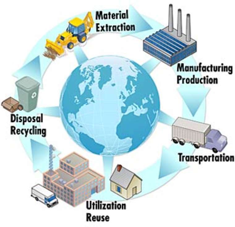
Material and manufacturing production cycle
Keywords
diagram, materials, manufacturing, production, cycle
Model Answer Audio
The diagram illustrates the manufacturing process starting from materials to disposal. At the first step, materials are extracted and moved to a production facility. Once the products are manufactured they are transported to places for use and reuse. Probably the use and reuse cycle continues for some time after which the products are either disposed or recycled. As a result of recycling they can again be used as raw materials for production.
Question 3
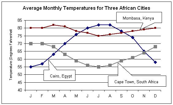
Average monthly temperatures for three African cities
Keywords
graph, monthly temperature, cities, Africa
Model Answer Audio
The graph compares the average monthly temperatures in three cities in Africa. In January, Cairo has the lowest temperature at 55, Cape Town is at 70 degrees and Mombassa is at 80 degrees. Cairo’s temperature increases steadily till July, while Cape Town’s keeps falling and going lower than Cairo’s in March. Mombassa shows only slight temperature during the year staying around 80 degrees throughout.
Question 4
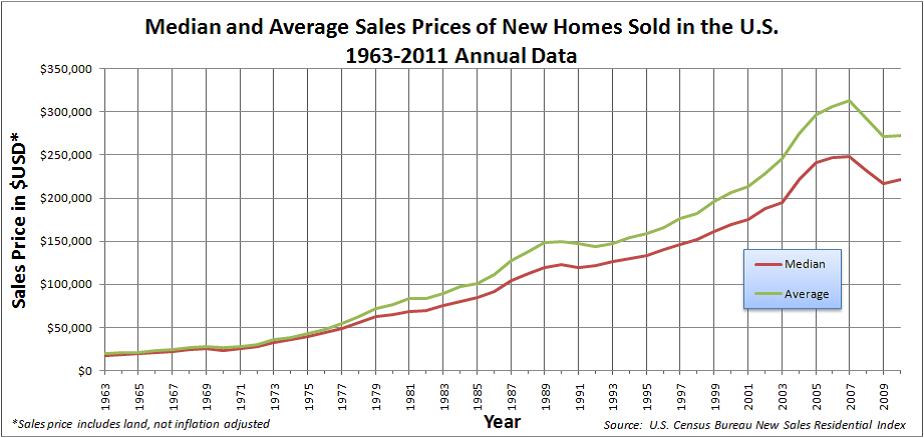
Median and Average sales prices of new homes sold in the US
Keywords
graph, median, average, home sale price
Model Answer Audio
The graph compares the median and average prices of homes sold in the U.S from 1963 to 2021. From 1963 to 1973, median and average prices remained the same around $25,000 dollars. After that the average became higher than the median price, both of which kept steadily increasing till 2011 when the average crossed 300,000 dollars and median touched 250,000. After that there was a fall, signaling an economic downturn.
Question 5
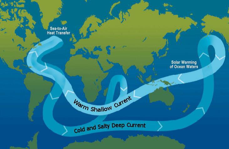
Ocean current and temperature
Keywords
diagram, ocean current, temperature
Model Answer Audio
The diagram illustrates the variation in the temperatures of ocean currents. The sea currents are cold at deeper levels. Warming of oceans by sun, cause the temperature of currents near the surface to have a higher temperature. This heat is transferred from the sea to air as water flows and leads to lower temperatures in deeper currents.
Question 6
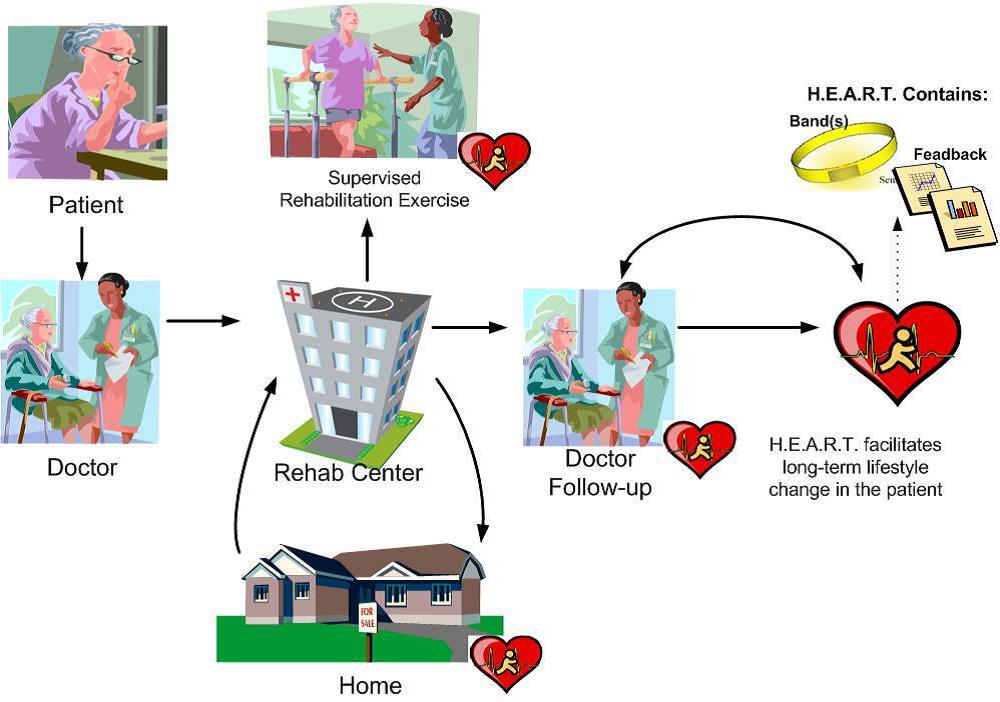
Rehab Center caring diagram
Keywords
diagram, rehab centre, healthcare, centre, process
Model Answer Audio
This diagram illustrates how treatment and caring is provided at the rehab centre. When a patient sees a doctor, the doctor can refer the patient to a rehab centre. At the rehab centre the patient is given supervised rehabilitation exercises under the HEART program. The program also extends to caring for the patient at home. Patient visits the rehab centre regularly and follows up with the doctor who manages the HEART program for the patient. The program aims a long term management and consists of bands and feedback.
Question 7
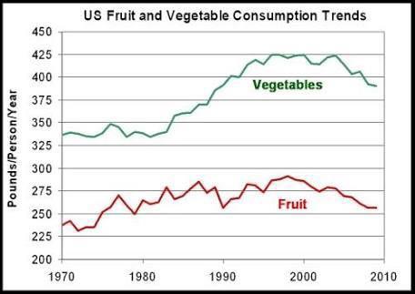
US fruit and vegetable consumption trends
Keywords
graph, fruit, vegetable, consumption, over years
Model Answer Audio
The graph highlights the consumption of fruits and vegetables in the US in pounds per person per year terms. In 1970 over 225 pounds of fruits were consumed, while over 325 pounds of vegetables were consumed by one person in a year. This increased more or less steadily till 2000 after which both of them have decreased slightly. Overall, much more vegetables are consumed in US compared to fruits.
Question 8
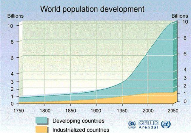
World population development
Keywords
image, world population, developing countries, industrialized/developed countries
Model Answer Audio
The image illustrates how the world population has grown in developing and industrialized countries from 1750 onwards, projected till 2050. In 1750, around 1 billion people lived in developing countries, while one tenth of that lived in industrialized countries. This figure remained more or less constant till 1950 after which the number of people in developing countries had a sharp increase projected to touch 10 billion by 2050. Industrialized countries have had a much more modest increase and will cross just over a billion in 2050.
Question 9
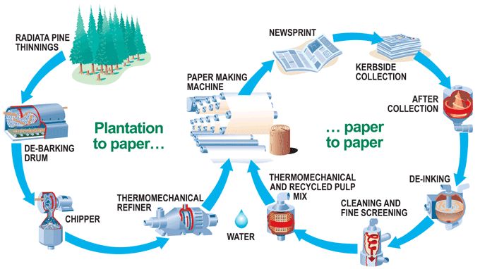
Paper recycling process
Keywords
diagram, process, paper manufacturing, recyling
Model Answer Audio
The diagram illustrates the process of paper manufacturing and recycling. Paper production starts with radiata pine thinnings which are fed into a de-braking drum which then goes into a chipper followed by a thermomechanical refiner. The output of the refiner goes into a paper making machine which finally produces the newsprint to be used in newspapers. Newspapers are collected from the kerb and after collection are de-inked, cleaned and through a mixing process again produce pulp which is used for paper making again.
Question 10
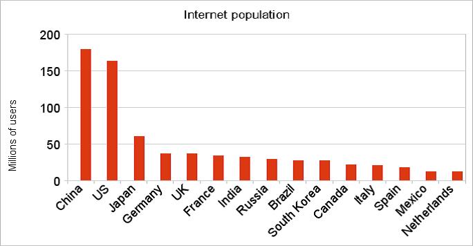
Internet population
Keywords
bar graph, internet population, countries
Model Answer Audio
The bar graph compares the internet population in various countries of the world. China has the largest internet population of over 180 million, followed by US at around 160 million. Japan has the next highest but is less than one third of that of the US. Countries such as Germany, UK, France, India, Russia have similar numbers less than 50 million, while other countries such as Italy, Spain, Netherlands have less than 10 million. It can be concluded that internet population varies vastly from country to country.
GrowSkills Pearson PTE Academic
for more resources , Follow our Websites and Pages
www.facebook.com/GrowSkills
www.GrowSkills.co.uk
www.GrowSkills.org
www.Engleze.com
www.facebook.com/groups/Engleze


