1- Single Line Chart Template
” The following graph gives information about <Title> .
The horizontal axis is <name of horizontal axis>, ranging from <the first number on the horizontal axis>
to <the last number on the horizontal axis>.
According to this graph, in the year of <the first number on the horizontal axis>, the value is <the value of the first point>.
And according to this graph, in the year of <the second number on the horizontal axis>, the value is <the value of the second point>.
The highest value is <the value of the highest point>, which is in <the corresponding value on the horizontal axis>.
On the contrary, the lowest value is <the value of the lowest point>, which is in <the corresponding value on the horizontal axis>.
In conclusion, if this trend continues, the <title> will keep decreasing / increasing in the future. ”
Model Answer :
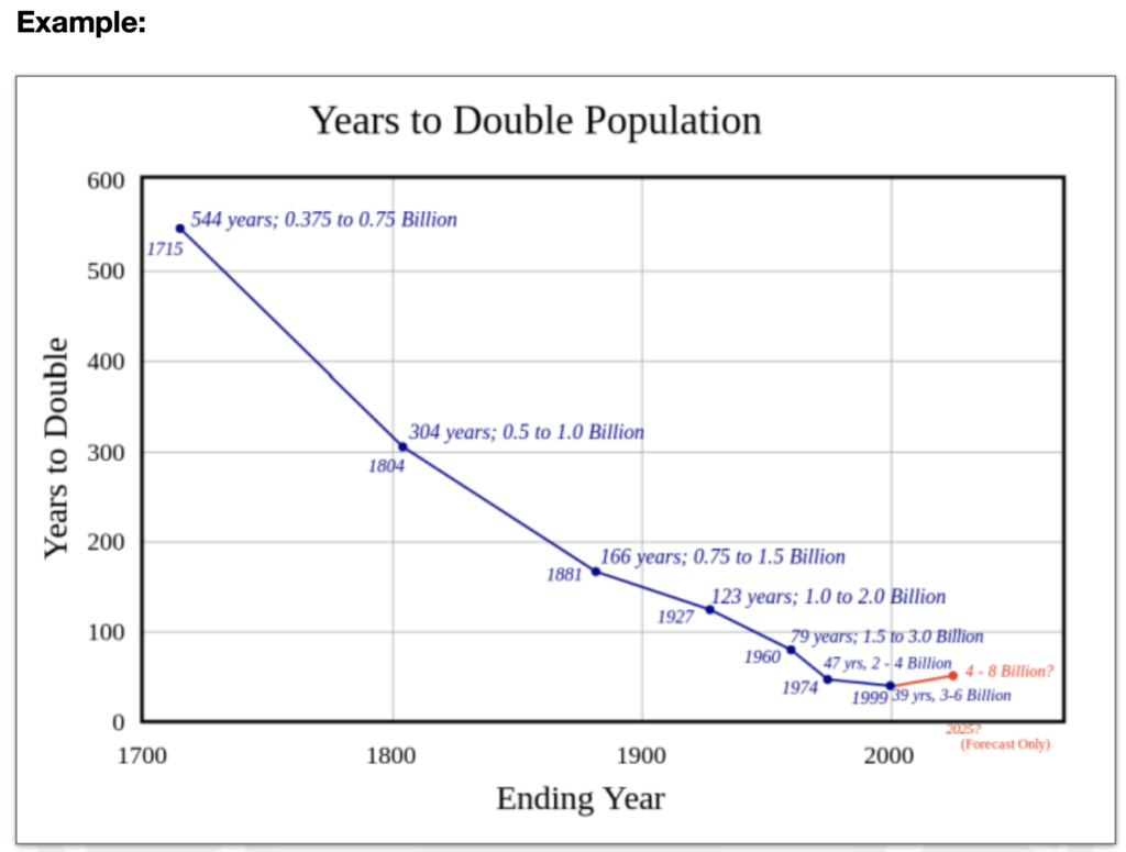
The following graph gives information about Years to double population.
The horizontal axis is ending year, ranging from seventeen hundred to two
thousand.
According to this graph, in the year of seventeen fifteen, the value is around five
hundred years.
And according to this graph, in the year of eighteen o four, the value is around
three hundred.
The highest value is around five hundred years, which is in seventeen fifteen.
On the contrary, the lowest value is thirty nine years, which is in nineteen ninetynine.
In conclusion, if this trend continues, the Years to double population will keep
decreasing in the future.
2- Multi-line Chart Template
” The following graph gives information about <Title>.
The items include <the headings of three lines>.
The horizontal axis is <name of horizontal axis>, ranging from <the first number on the horizontal axis> to <the last number on the horizontal axis>.
According to this graph, in <the first number on the horizontal axis>, the value of <the heading of line A> is around <the value of the first point in line A>, and that of <the heading of line B> is higher/lower, which is around <the value of the first point in line B>.
According to this graph, the highest value of <line A> is <the highest point of line A>, which is in <the corresponding value on the horizontal axis>.
According to this graph, the value of <one line’s heading> is higher than <another line’s heading>(, from <the starting time> to <the ending time>).
In conclusion, <line’s heading> has the highest <title>. ”
Model Answer
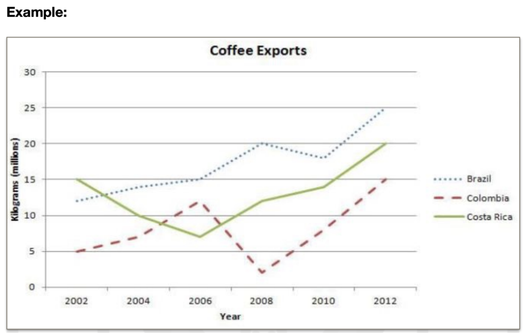
The following graph gives information about coffee exports.
The items include Brazil, Colombia, and Costa Rica.
The horizontal axis is year, ranging from two thousand and two to twenty-twelve.
According to this graph, in two thousand and two, the value of Colombia is around
five, and that of Brazil is higher, which is around ten.
According to this graph, the highest value of Brazil is 25, which is in tweny twelve.
According to this graph, the value of Brazil is higher than Colombia(, from two
thousand and two to twenty twelve).
In conclusion, Brazil has the highest coffee exports.
3- Bar Chart Template
” The following graph gives information about <Title> .
The items include <three bars’ headings>.
According to this graph, in <the first bar>, the value of <the first year> is around <the corresponding value>, and that of <the second year> is higher/lower, which is around <the corresponding value>.
You can see from this graph that the highest value of <the second bar> is in <year>, which is <the corresponding value>.
You can also see from this graph that the highest value of <year> is <bar’s heading>.
In conclusion, <bar’s heading> has the highest <title>.
Model Answer
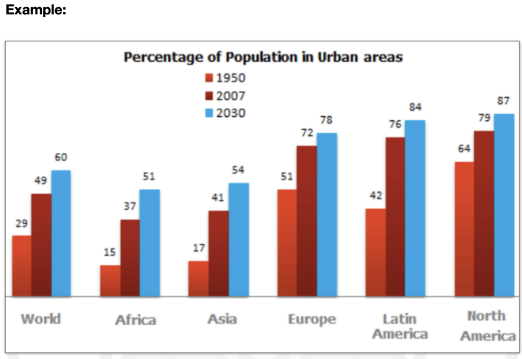
The following graph gives information about percentage of population in urban
areas.
The items include World, Africa and Asia.
According to this graph, in World, the value of nineteen fifty is around twenty-nine,
and that of two thousand and seven is higher, which is around forty-nine.
You can see from this graph that the highest value of Africa is in twenty-thirty,
which is fifty-one.
You can also see from this graph that the highest value of twenty-thirty is North
America.
In conclusion, North America has the highest percentage of population in urban
areas.
4- Pie Chart Template
” The following graph gives information about <Title>.
The items include <three portions’ headings>.
According to this graph, the proportion/value of <some portion> is around <the corresponding value>, and that of <another portion> is higher/lower, which is around <the corresponding value>.
You can see from this graph that the highest proportion/value is <the largest portion>, which is around <the corresponding value>.
You can also see from this graph that the lowest proportion/value is <the smallest portion>, which is around <the corresponding value>.
In conclusion, <the largest portion> has the highest <title>. ”
Model Answer
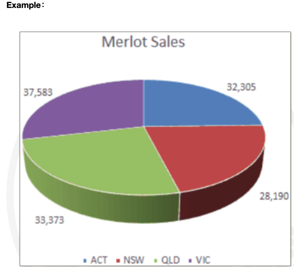
The following graph gives information about Merlot Sales.
The items include ACT, NSW, QLD and VIC.
According to this graph, the value of ACT is around thirty-three thousand,
and that of VIC is higher, which is thirty-seven thousand.
You can see from this graph that the highest value is VIC, which is around thirtyseven thousand.
You can also see from this graph that the lowest value is NSW, which is around
twenty-eight thousand.
In conclusion, VIC has the highest Merlot sales.
5- Table Template
” The following graph gives information about <Title> .
The items include <some headers in the table>.
According to this graph, in <the first row and the first column>, the value of <its header> is around <its value>.
And in <the second row and the first column>, the value of <its header> is around <its value>, which is higher/lower.
You can see from this graph that the highest value is in <year>, which is around <the corresponding value>.
You can also see from this graph that the lowest value is in <year>, which is around <the corresponding value>.
In conclusion, <year> has the highest <title> ”
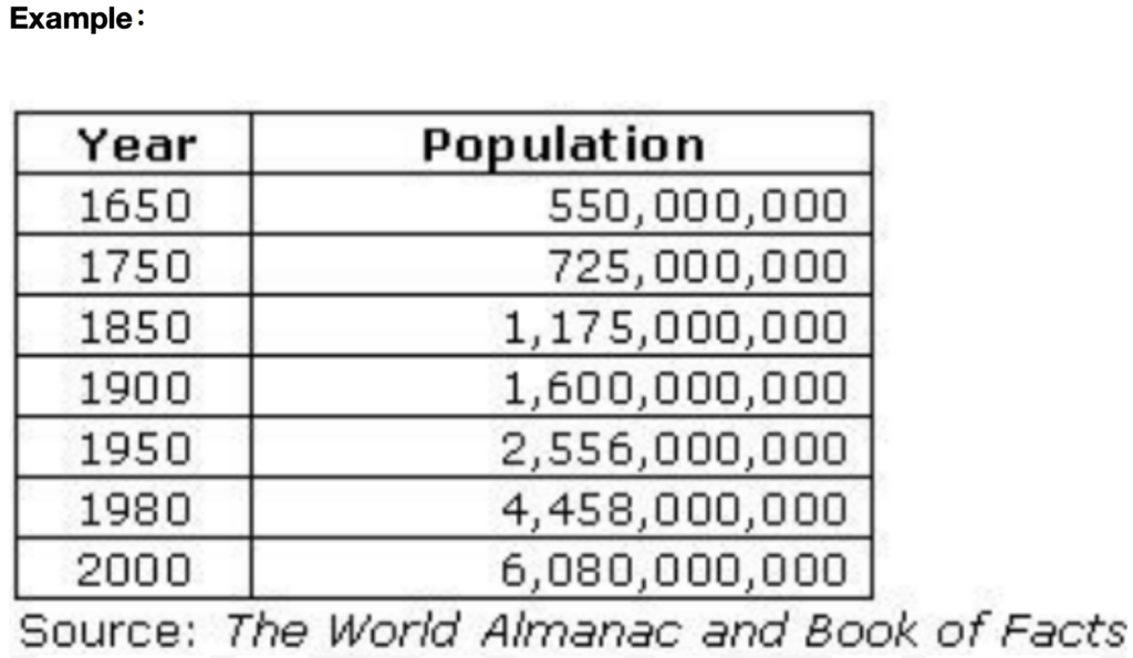
Model Answer
The following graph gives information about population.
The items include year and population.
According to this graph, in sixteen fifty, the value of population is around fivehundred-fifty million.
And in seventeen fifty, the value of population is around seven hundred million,
which is higher.
You can see from this graph that the highest value is in two thousand, which is
around six billion.
You can also see from this graph that the lowest value is in sixteen fifty, which is
around five hundred million.
In conclusion, two thousand has the highest population.
6- Flow Chart Template
” The following graph gives information about < title / any phrase shown on the graph >.
It shows how the process is done.
The steps include <some steps’ names>,
According to this graph, the fist step is <name of the first step>,
Followed by that, the second step is <name of the second step>,
You can see from this graph that the third step is <name of the third step>.
You can also see from this graph that the next step is <name of the next step>.
Followed by that, the next step is <name of the next step>.
Followed by that, the next step is <name of the next step>.
…<If you have time to spare, you may include more steps>
The final step is <name of the final step>
In conclusion, the process will repeat / this graph is very informative.
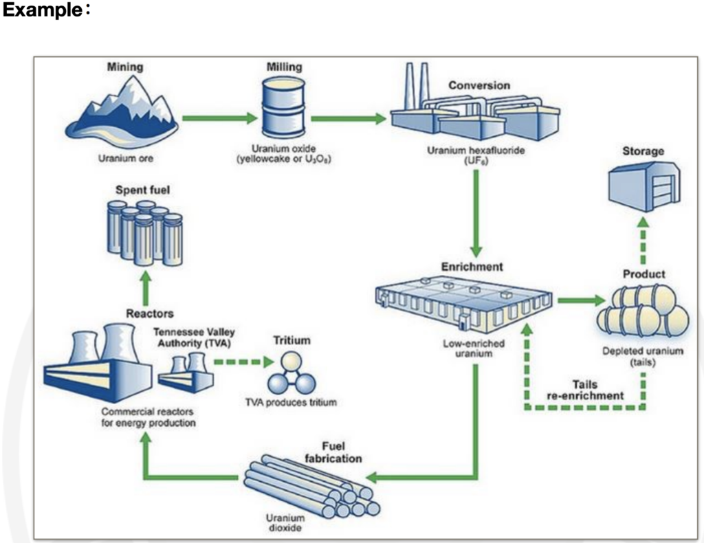
Model Answer
The following graph gives information about mining.
It shows how the process is done.
The steps include mining, conversion and storage.
According to this graph, the fist step is mining.
Followed by that, the second step is milling.
You can see from this graph that the third step is conversion.
You can also see from this graph that the next step is enrichment.
Followed by that, the next step is fuel fabrication.
Followed by that, the next step is reactors.
The final step is spent fuel.
In conclusion, this graph is very informative.
7- Map (Without Data) Template
” The following graph gives information about < Title> .
Data of different areas are displayed on the map.
At the central area, there are <names of some places in the center >.
At the left area, there are <names of some places on the left>.
According to this graph, the largest area is <name of the largest area>.
In comparison, the smallest area is <name of the smallest area>.
In conclusion, there are <a number> areas shown on the map.
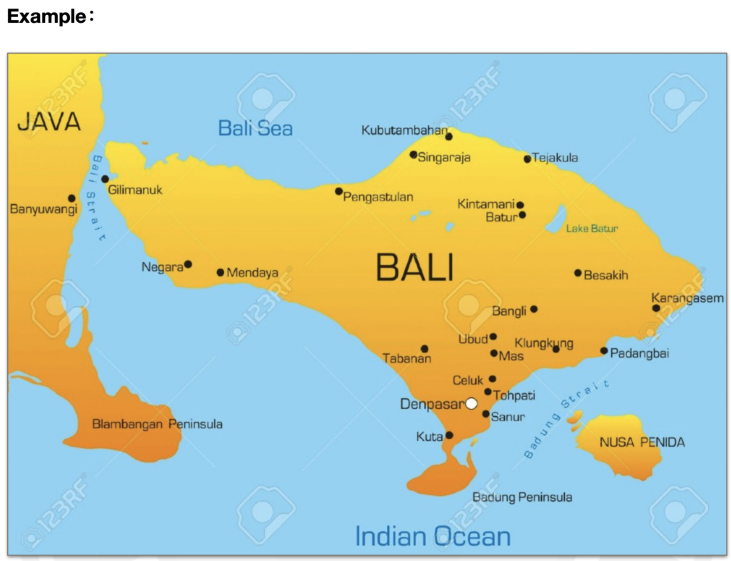
Model Answer
The following graph gives information about Bali.
Data of different areas are displayed on the map.
At the central area, there are Bali, Bangli, Ubud and Tabanan.
At the left area, there are Java and Bali Sea.
According to this graph, the largest area is Bali.
In comparison, the smallest area is Nusa Penida.
In conclusion, there are three areas shown on the map.
8- Map (With Data) Template
” The following graph gives information about < Title > .
Data of different areas are displayed on the map.
The items include <the legends>.
According to this graph, the largest areas of <one legend> are in <place names>.
In comparison, the smallest areas of <one legend> are in <place names>.
You can see from this graph that the largest areas of <another legend> are in <place names>.
In conclusion, the area of <one legend> is much larger than that of <another legend>.
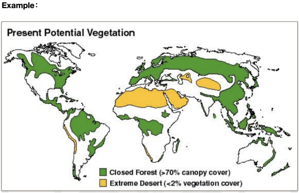
Model Answer
The following graph gives information about present potential vegetation.
Data of different areas are displayed on the map.
The items include Closed Forest, which has more than 70% of canopy cover, and
extreme desert, which has less than 2% of vegetation cover.
According to this graph, the largest areas of closed forest are in North America and
Asia.
In comparison, the smallest areas of closed forest are in Australia.
You can see from this graph that the largest areas of extreme desert are in Africa.
In conclusion, the area of closed forest is much larger than that of extreme desert.
9- Picture (Without Data) Template
” The following graph gives information about < a main object in the picture> .
This is a very beautiful picture, and it shows a number of things.
According to this graph, at the central area, there is a < an object in the center>; the colour of it is < colour> .
You can see from this graph that, at the right area, there is < an object on the right>; the colour of it is < colour> .
You can see from this graph that, at the background, there are < the background>, the colour of those are < colour> .
The weather is sunny. The sky is blue and clear.
In conclusion, this picture is very informative. ”
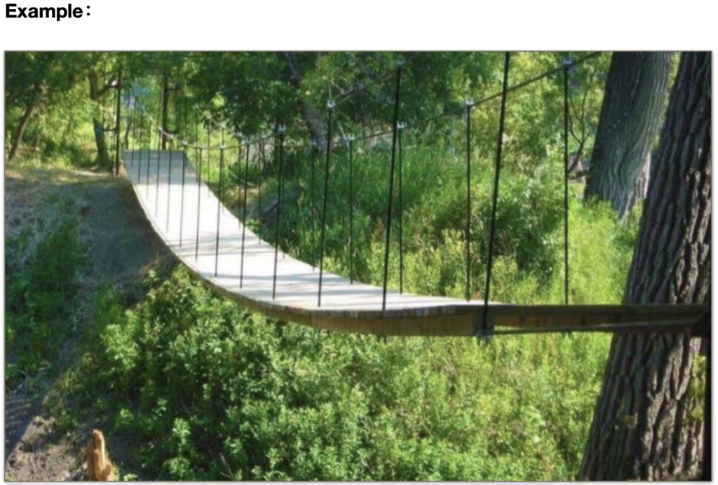
Model Answer
The following graph gives information about a bridge.
This is a very beautiful picture, and it shows a number of things.
According to this graph, at the central area, there is a bridge; the colour of it is
brown.
You can see from this graph that, at the right area, there is an area of grass; the
colour of it is green.
You can see from this graph that, at the background, there are many trees, the
colour of those are green.
The weather is sunny. The sky is blue and clear.
In conclusion, this picture is very informative.
10- Picture ( With Words and Data )
For this type of picture, just read whatever you see, and use the filler phrase “According to the graph / You can see from this graph that” to start your sentence.
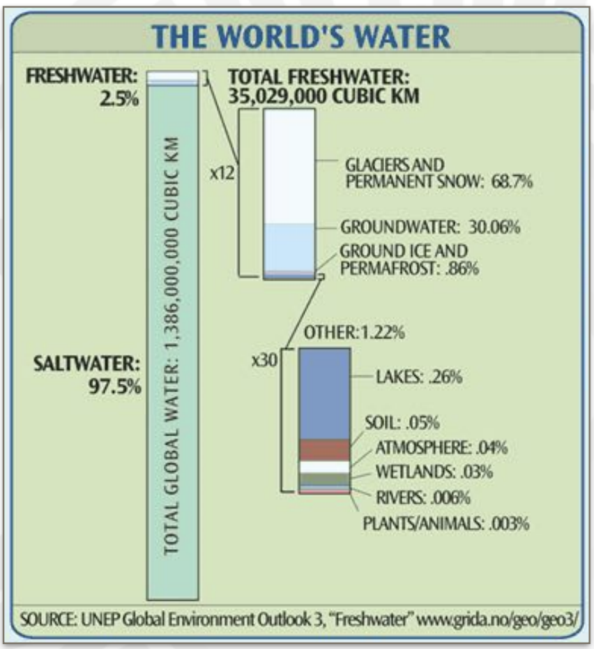
Model Answer
The following graph gives information about the world’s water.
According to this graph, the items include saltwater and freshwater.
You can see from this graph that the value of the saltwater is 97%.
And the value of freshwater is 2.5%.
The total freshwater is 35 million cubic km.
According to this graph, it consists of glaciers and permanent snow, which is 68%,
and groundwater, which is 30%.
As you can also see that it also consists of 0.8% of ground ice, which further
consists of lakes, soil and atmosphere.
In conclusion, this graph is very informative / saltwater has the highest proportion.
GrowSkills Pearson PTE Academic
for more resources , Follow our Websites and Pages
www.facebook.com/GrowSkills
www.GrowSkills.co.uk
www.GrowSkills.org
www.Engleze.com
www.facebook.com/groups/Engleze


